Philosophy
Sigill does not simulate the archive. It evokes it.
Polmanarkivet exists at the intersection of archive and museum — not as a compromise between the two, but as a place where both are fully present at once. The design language was built to serve that reality. Every element, from the weight of a caption to the shadow beneath a portrait, is an imagined representation of a physical thing: not a literal imitation, but an evocation. The feeling of a document handled. The sense of a painting hung. The quiet of a reading room.
This is a deliberate rejection of the soulless, undifferentiated quality of most web interfaces. Sigill is immersive, tactile in suggestion, historically weighted — but never loud, never decorative for its own sake. Every interaction serves the experience. Nothing announces itself.
Logo
The Coat of Arms icon is our identity, the face of Polmanarkivet. The icon and our strong wordmark are our most recognisable brand assets.
The preferred approach is to use the combined logo — icon and wordmark— in contexts where Polmanarkivet is unfamiliar and the Coat of Arms icon by itself, unlocked from the wordmark when already established to the audience. This allows us flexibility across different forms of communication and to use the logo version with the greatest impact.
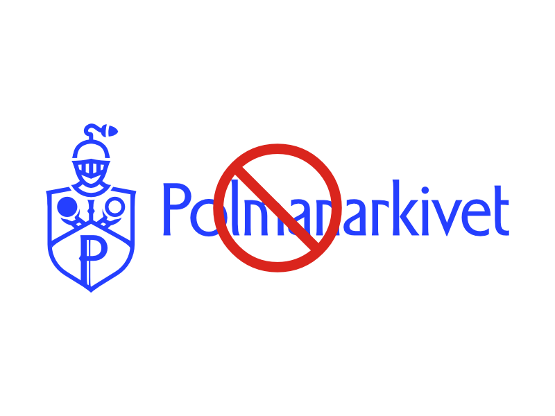
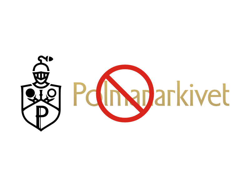
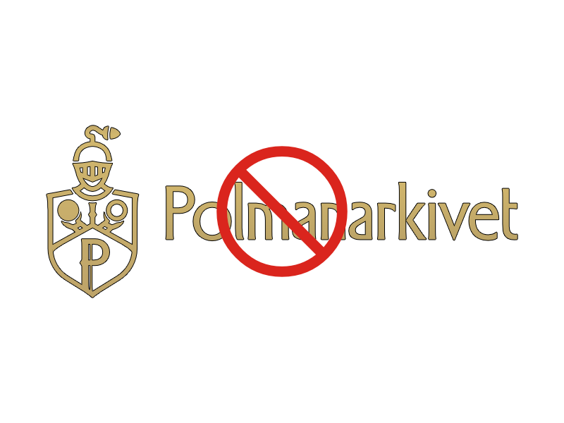
Logo Do’s and Dont’s
Using our logos consistently ensures brand recognition and allows for creativity elsewhere. Below are some examples of incorrect use of our logos.
Examples of incorrect use of Polmanarkivet logo.
Download Logos
Download our full logo and icon variant in the appropriate colours and vector format.
Colours
Colour in Sigill is not decoration. It is evidence.
The palette is built from the materials of the archive itself — warm neutrals that suggest aged paper, linen, and ink — punctuated deliberately by gold. Nothing competes for attention. Everything defers to the content, until gold appears, and when it does, it means something.
Guld
Gold is the most consequential colour in Sigill. It appears where something needs to be ratified — a caption border, a divider, a hover state — not to enrich the visual field, but to mark it. In the way a seal authenticates a document, Guld authenticates a moment. It is used sparingly, and that restraint is the point.
Our Palettes
Scriptorium - Light
The daylight palette. Warm parchment backgrounds, ink text, the feeling of working with documents in a well-lit room. Accessible, open, unhurried.
Noctuary - Dark
The after-hours palette. Deep charcoal, vellum text, the same Guld punctuation. The archive quieter, more focused — the feeling of reading by lamplight rather than daylight.
Voice
The record speaks first. Everything else follows.
Polmanarkivet's voice is grounded in primary sources — court records, letters, estate inventories, tänkeböcker. These documents are treated as the authoritative text. We quote them directly, name them precisely, and let them establish the scene before interpretation begins. The archive is not a backdrop for our conclusions; it is the story.
From that foundation, we build atmosphere. A brawl in a 17th-century Stockholm tavern requires the tavern — its legislation, its signage, its culture of masculinity and drink. We research the room as carefully as the event, because context is not supplementary. It is what makes the past inhabitable.
The tone is scholarly but not airless. Where the material is absurd, we let it be absurd. Where irony is present in the record itself, we don't suppress it. Wit, when it appears, is structural — embedded in how something is framed, never announced.
We do not write down to our readers, nor do we over-explain. We assume a reader who is willing to slow down.
Typography
Two typefaces. One hierarchy. No exceptions.
Our typographic system establishes the scholarly character of Polmanarkivet while keeping every page legible and structured. Each typeface has a distinct and fixed role — they are not interchangeable.
Our Typefaces
Headings: Cormorant Garamond
Cormorant Garamond is our heading typeface, chosen for its historical character and scholarly authority. Its sweeping, high-contrast letterforms echo 17th-century copperplate engravings — the visual world from which much of Polmanarkivet's source material comes. It is used exclusively for H1 and H2: titles, impactful headlines, and major navigational signposts. Always typeset in sentence case.
Body & UI: Source Sans 3
Source Sans 3 is our typeface for everything else — body text, navigation, labels, captions, metadata, and all UI elements. Its clean, legible letterforms provide a quiet counterpoint to Cormorant Garamond's expressiveness. H3 through H6 are set in Source Sans 3. So is every paragraph, button, and form field on the site.
Typographic Scale & Usage
Our typographic scale provides a clear hierarchy and visual rhythm for all content. Below are the specific guidelines for usage, followed by examples.
Headings
Headings (H1-H2) are set in Source Serif 4. Headings (H3-H6) are set in Source Sans 3. All headings should be typeset in sentence case. Do not use all caps or all lowercase. For optimal legibility, use default letter spacing and kerning.
Heading 1
Heading 2
Heading 3
Heading 4
Heading 5
Heading 6
Body Text
All standard paragraph text is set in Source Sans 3 with a line-height of 1.5 for optimal readability.
The Polman, Påhlman, von Pohlmann family can be traced to the Late Middle Ages. It is said that the family came from the parish of Hille, Westphalia, where there was a noble family Polman, whose coat of arms depicted an arm holding a ring.
Spacing & Rhythm
Space is not absence. It is instruction.
Sigill uses space as a curatorial gesture — the same logic that places a single object in a museum display case with nothing competing around it. On structural pages, generous white space isolates each element in turn, directing the reader's attention before releasing it to the next thing. The homepage does not present everything at once. It presents one thing, then another, with room between them to breathe.
This principle applies both vertically — in the space between sections as the page unfolds — and horizontally, in the margins and padding that give individual components room to sit without crowding.
The spacing scale is deliberate. Consistent values recur throughout the system: 1.5rem, 2rem, 3rem, 4rem, 6rem. These are not arbitrary — they create a rhythm the eye recognises even when it cannot name it. That said, mathematical consistency is the starting point, not the final word. Where something feels visually off despite being technically correct, the feeling takes precedence. The scale serves the eye, not the other way around.
Spacing in Long-Form Articles
Articles with dense scholarship follow a different logic. Literal white space between paragraphs would read as interruption — a gap in a reading column signals ending, not pause. Here, breathing room is achieved editorially: through images, pull quotes, gallery breaks, curator's notes, and chapter dividers. The page still breathes. It just breathes through its components rather than its margins.
Core Elements
The smallest units of the system. Consistent everywhere, without exception.
Border Radius
All primary interface elements — cards, images, buttons — use a standardised corner radius of 8px. The intention is not decorative softening but a subtle departure from the harshness of digital rectangles, hinting at the physical edges of paper, card, and archival materials. Applied consistently, it becomes invisible — which is exactly the point.
Buttons
Sigill uses two distinct button styles, each serving a different context.
Primary — a solid background fill using the appropriate Scriptorium or Noctuary palette variant. Used for standard calls to action across the site.
Immersive — used exclusively in dark, overlay contexts such as the homepage hero. A transparent outline at rest, it fills with Guld and switches to dark text on hover. The restraint of the default state and the warmth of the hover are both intentional — the button should feel like it belongs to the room it's in.
Archival Tags
Inline code blocks across the site are restyled as Archival Tags — small, self-contained labels that resemble physical museum catalogue tags or archive reference slips. They appear in body text to surface metadata, keywords, ranks, or classifications without interrupting the reading flow. The treatment is deliberately understated: a muted background, a fine border, and a slightly condensed weight that separates them visually from surrounding prose without shouting.
An example of an Archival Tag and another Status: To Read.
The Fleuron
Every article closes with a small gold mark — the Fleuron. It appears after the final paragraph as a pure CSS element, rendered in Guld using a mask of the Polmanarkivet signature mark. It serves no navigational purpose. It is simply a signal that the document is complete — the equivalent of a scribe's colophon, or the wax seal pressed at the close of a letter. Articles tagged with #no-fleuron suppress it where the context demands a different ending.
The Scholarly Divider
The toggle and accordion element is stripped of its default styling and rebuilt as a structural divider. A single top border marks the opening; the heading sits flush against it with no background, no shadow, no rounding. When expanded, the content appears beneath a left-aligned Guld border. The interaction is quiet and purposeful. Nothing animates unnecessarily.
Editorial Components
Bespoke content blocks that transform standard CMS formatting into moments of scholarly elegance. Each has a name, a purpose, and a logic. None exist for decoration alone.
Drop Caps
To signal the start of a major story, long-form articles tagged with #drop-cap feature a classic typographic drop cap, set in our signature gold.
This is an example of a drop cap, creating a beautiful and classic opening for a long-form article. It invites the reader to settle in for a substantial story, adding a touch of literary and scholarly tradition to the page.
The Museum Plaque
Image captions are styled as physical museum placards. A fine Guld border runs along the top, separating the caption from the image above it. The text is set in Source Sans 3, italicised, muted in colour, and constrained in width — never running the full column. It provides context without competing with the image. The name is an evocation, not a literal description: there is no ornate frame, no gold leaf. Just the quiet authority of a well-placed label.
The Scholarly Aside
Standard blockquotes are used exclusively for citing primary sources — court records, letters, official documents. They are styled with a clean neutral border and set in Source Sans 3, giving them a formal, transcript-like quality. The restraint is intentional: the source should feel like evidence, not decoration. It steps forward to be read, then recedes.
This is a standard blockquote, designed for citing sources with scholarly clarity.
The Editorial Statement
Pull quotes are reserved for phrases that deserve to stand alone — a line from the record, a conclusion that reorients everything that came before it. They are styled as purely typographic statements: large, bold Cormorant Garamond, centred, with generous margin above and below. No border, no background, no graphic device. The type itself carries the weight. Used sparingly, they stop the reader. Used too often, they lose that power entirely.
This is our "Editorial Statement" pull quote, designed for maximum typographic impact.
Curator's Notes
Callout blocks are restyled as Curator's Notes — asides written in the voice of the archive rather than the historical record. They carry a soft parchment background and a fine border, lifting them gently from the page without breaking the reading flow. The emoji icon used in Ghost's native callout block is retained where present, giving the component a slightly warmer, more personal register than the surrounding scholarship.
The Gallery Wall
Images inside articles are treated as paintings hung in an exhibition room — not embedded files, but objects with physical presence. Each image carries a layered drop shadow that lifts it from the page, and a 2px border radius that softens without rounding. On hover, a subtle contrast and brightness shift rewards attention without announcing itself. The effect is never literal — there is no frame, no mat, no gallery wall rendered behind the image. Only the suggestion of one, achieved through shadow and stillness.
Gallery grids follow the same treatment across every image in the row. No image is styled differently from its neighbour. The wall is consistent.
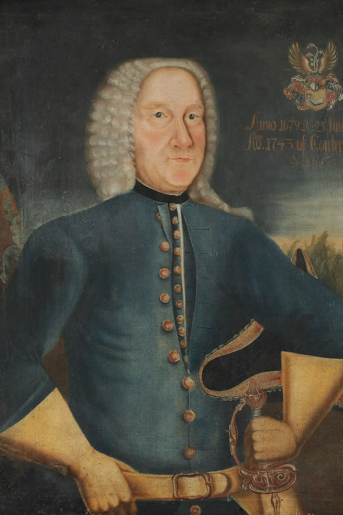
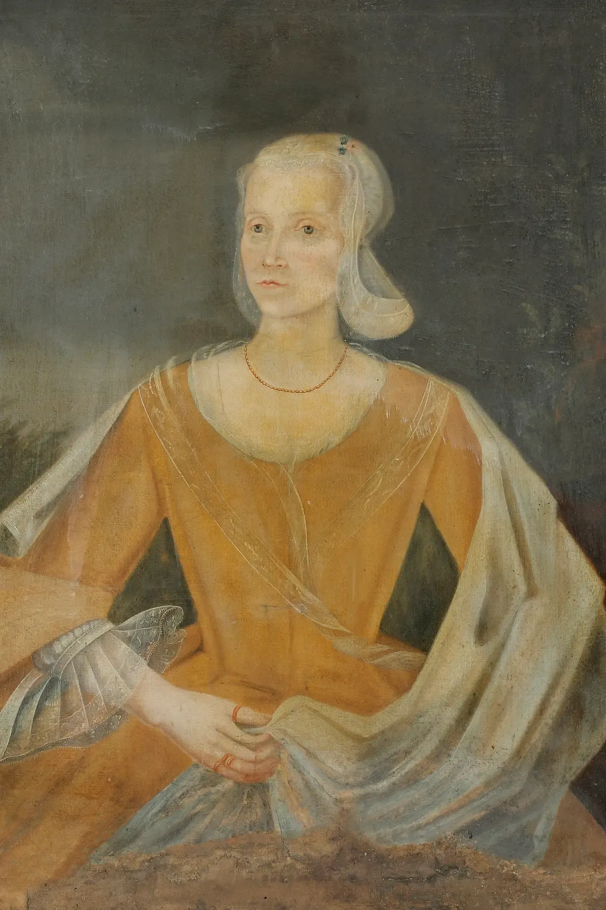
Fig. 9 - Carl Gustaf Påhlman (1679–1757), 1743, oil on canvas. Image by Kulturparken Småland (CC BY 4.0). Fig. 10 - Christina Elisabet Renner (1712–1769), 1743, oil on canvas. Image by Kulturparken Småland (CC BY 4.0).
Marginalia
On wide viewports, supplementary notes float into the right margin alongside the body text — set in Source Sans 3 at a reduced size, bordered on the left by a fine Guld line. They do not interrupt the reading column. They exist in the peripheral vision of the page, available to the reader who looks for them without demanding attention from the reader who doesn't. On smaller screens they disappear entirely, suppressed rather than collapsed. The marginalia is a desktop privilege — a reward for reading on a surface wide enough to hold it.
Photography
The image should feel like it belongs to the same world as the source material.
Polmanarkivet does not use photography as illustration. Every image is chosen because it is genuinely of its time and place — a primary or near-primary visual record that extends the archive rather than decorating it. A painting, an engraving, a map, a photograph: each must earn its place on the page the way a footnote earns its place in the text.
Sourcing
We draw from institutional collections — national archives, state museums, university libraries, and public heritage databases. Images are cited with the same rigour as any other source: creator, date, medium, and holding institution.
We do not use AI-generated imagery. It is irreconcilable with the archive's commitment to authenticity.
The Sourcing Hierarchy
The ideal image is period-accurate, geographically specific, and directly relevant to the content. When that doesn't exist, we work outward: adjusting geography before era, and era before subject. If a 17th-century Stockholm tavern can't be found, a 17th-century German one is preferable to an 18th-century Swedish one. If neither exists, we return to the article and find a different image idea altogether — an object, a document, a portrait, something else present in the text. The image changes. The standard doesn't.
Captions & Accessibility
All non-decorative images carry a caption. The minimum information is creator, date, and source. Where known, medium is included. Captions are formatted as Museum Placards — see Editorial Components.
All images carry descriptive alt text. This is not optional. The archive is built on the principle that the record should be accessible to anyone who seeks it.
Motion & Animation
Nothing moves without a reason. Nothing announces itself.
Motion in Sigill follows the same philosophy as every other element in the design language: it serves the experience without drawing attention to itself. The reader should never notice an animation as an animation. They should only notice that the page feels considered, unhurried, alive.
The Principles
All transitions use ease timing — typically 0.2s to 0.25s — which mirrors the natural deceleration of a physical object coming to rest. Nothing snaps. Nothing bounces. The motion is closer to the turn of a page than the click of a button.
Hover states across the system follow this consistently: a colour shift, a subtle lift, a gentle translation. The interaction confirms that something is responsive without performing responsiveness.
Scroll-Triggered Animation
On certain pages, elements animate into view as the reader scrolls — fading in rather than appearing. The director's welcome on the homepage is one example: paragraphs surface gradually as the reader descends, as if the page is being read aloud at the pace it is being discovered. The effect is subtle enough that readers who don't look for it won't find it. Those who do will feel it as atmosphere rather than interface.
Scroll-triggered animation is used sparingly and only where it reinforces the sense of entering and moving through a space. It is never used to fill silence or signal technical sophistication.
What Motion Is Not
Motion in Sigill is never decorative, never loud, and never faster than the reader. No element spins, pulses, or demands attention through movement. The archive is a quiet place. The interface should feel like one.